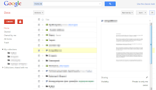
Google Docs has a new interface inspired by Google+ and you can try it here. The interface is clean and there's a lot of white space. You'll also find the familiar red buttons, the gray buttons, the new scrollbars and the labelless search button.

The new interface looks better, but there's a lot of white space that could be used to show more information about the files. The details view is no longer available from the interface, but you can enable it in the old UI and the setting is preserved.
No comments:
Post a Comment